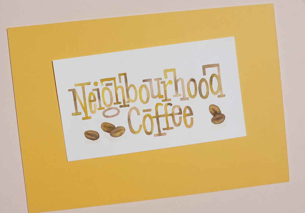
Café signage
CONCEPT
Before visiting any location, I research the interior design and menu in order to prepare the signage. Depending on the brief, I choose either chalk, paint or digital products to prepare and complete the project.
HAND PAINTING
After mapping out wording and illustration, I complete each project to the highest standard. Here’s a short process video of Neighbourhood Coffee.
CHALK PASTEL
This signage is created using chalk pastel, black paint, and a fixative to maintain vibrancy.


